
Post categories

  • Home
  • Contact Us
  • Login
  • Register
Home
  • INDUSTRY UPDATES
    • Packaging News
    • Innovations
    • Packaging Offers
    • Press Releases
    • Events
    • resources
  • BLOG
  • OUR PRODUCTS
    • Big Book of Packaging
  • OUR PARTNERS
    • Bernhardt
    • EMA
    • Haemotronic
    • Linhardt
    • Ypsomed
    • Plas-Tech Engineering
    • Roechling
    • Sanok Rubber
    • Schreiner
    • Polycine
    • Yukon Medical
    • Bonini
  • SERVICES
    • CONSULTING
    • DESIGN SERVICES

Breadcrumb

  1. Home
  2. SuckerPunch Gourmet Unveils Punchy New Logo and Packaging

SuckerPunch Gourmet Unveils Punchy New Logo and Packaging

Profile picture for user GraniaJain
By GraniaJain on Fri, 01/08/2021 - 13:19

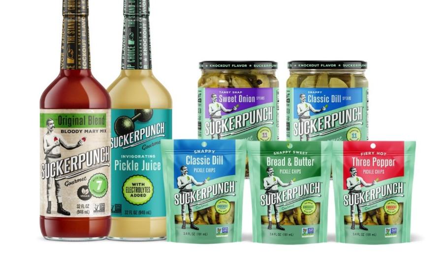
"Our entire portfolio, but especially our signature spiced pickles, is really different than anything else that's on shelves, and while it served us well for years, our former packaging just wasn't quite right for us anymore given who we are now and where we want to go in the future," said Alok Advani, CEO of SuckerPunch Gourmet. "We're very excited to debut a new look this year that better portrays our brand and product line, but still maintains the familiar elements of our identity that our consumers know and love."

SuckerPunch Gourmet's new packaging was designed to be fresh, modern and fun, while still maintaining ties to its original identity and roots. The brand's iconic boxer emblem has been softened, with a nod to vintage prizefighters, while simultaneously re-illustrating him in a modern Shepard Fairey-style. SuckerPunch Gourmet also created a brand block on the front of each product label using bold, saturated colors that clearly distinguish the flavor varieties and make it easy for shoppers to quickly and easily find their favorite pickle flavor. As a means to drive home unique points of differentiation, the refreshed packaging includes pops of critical elements such as a Non-GMO Project Verified logo, an "11-spice" icon that is shaped like a pickle chip, and back panel romance copy that's modeled after a vintage boxing poster. With a new look from top to bottom, SuckerPunch even gave the lids a revamp calling out the "knockout flavor" as a reminder for every consumer reaching for or opening a jar.

SuckerPunch Gourmet Unveils Punchy New Logo and Packaging
redesign
Brand Image
packaging

Follow Us

  • linkedin
  • facebook-f
  • twitter

Explore

  • Home
  • Contact Us
  • Login
  • Register

Company

  • Archive
  • Blog
  • Events
  • Packaging News
Autentico develops Anti-Counterfeit Packaging !
20 Mar, 2023
Standardized packaging on vapes found to reduce appeal to teenagers
20 Mar, 2023
Freppel Imprimeur Invests in Asahi CleanPrint AWP™ Water-Washable Plates
19 Mar, 2023

Footer menu

  • Privacy
  • Terms and conditions
Home
  • INDUSTRY UPDATES
    • Packaging News
    • Innovations
    • Packaging Offers
    • Press Releases
    • Events
    • resources
  • BLOG
  • OUR PRODUCTS
    • Big Book of Packaging
  • OUR PARTNERS
    • Bernhardt
    • EMA
    • Haemotronic
    • Linhardt
    • Ypsomed
    • Plas-Tech Engineering
    • Roechling
    • Sanok Rubber
    • Schreiner
    • Polycine
    • Yukon Medical
    • Bonini
  • SERVICES
    • CONSULTING
    • DESIGN SERVICES
Clear keys input element