


The shelf you browse at the supermarket may be the world's most unlikely museum.
Look closely at that olive oil label: the Grecian key border is not accidental. The tea tin with its ink-wash mountains echoes 1,000-year-old Song Dynasty scroll paintings. The whiskey bottle's Celtic knotwork traces back to illuminated manuscripts. Across industries and continents, modern packaging designers are reaching deep into antiquity, and the evidence suggests they are right to do so.
From Utility to Art: The Long Arc of Packaging History
Packaging itself is ancient. Research on its evolution notes that early humans used natural materials, tree leaves, bamboo, lotus leaves, coconut shells, animal skins, as the first containers. As civilisations grew, so did the sophistication: ceramics, lacquerware, metalwork, jade. But crucially, the shift from purely functional containment to aesthetically intentional design happened long before the Industrial Revolution.
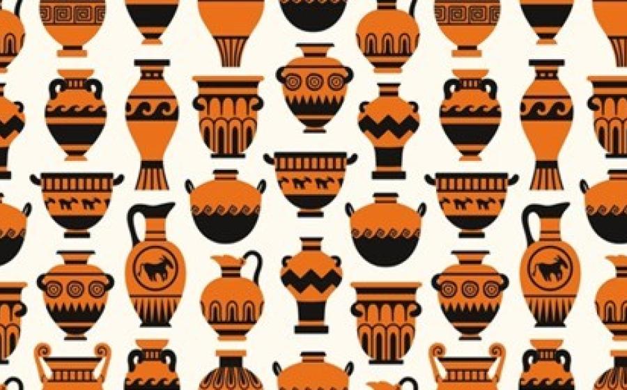
Ancient packaging began encoding meaning: status, wealth, cultural identity, through decorative motifs, colour choices, and material selection. The decorated amphora of ancient Greece was not simply a wine vessel; it was a signal of origin, quality, and taste. This idea, that packaging communicates far more than its contents, is the same logic that drives a high-end perfume bottle today.
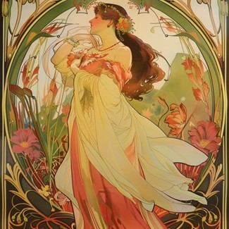
The Art Nouveau and Art Deco movements of the late 19th and early 20th centuries made explicit what had always been implicit. Art Nouveau, led by figures like Alphonse Mucha, brought delicate curves, organic plant forms, and intricate ornamentation into commercial packaging and poster design. The movement's core ambition, bringing high art to the masses through industrial reproduction, created a template that packaging designers still follow. Art Deco followed with geometric symmetry, bold contrasting colours, and a language of luxury that remains instantly recognisable on cosmetics and spirits packaging nearly a century later.
The Ancient Sources Modern Designers Draw From
Chinese Traditional Arts
Arguably the richest single stream of ancient influence in contemporary packaging is Chinese traditional art. Academic research consistently identifies several key sources.
Calligraphy has become one of the most widely applied ancient forms. Its formal beauty, the variation between thick and thin strokes, the dynamic tension between large and small characters, gives packaging a visual sophistication that cannot be replicated by digital type. The interplay of ink and paper, of dense and sparse, translates directly into packaging layouts that feel composed rather than cluttered.
![]()
Tuanhua design
Auspicious patterns, such as dragon and phoenix motifs, "tuanhua" roundel designs, and cloud patterns originating from Shang Dynasty bronze work, appear persistently on premium gift packaging, particularly for mooncakes, tea, and spirits. These are not decorative choices alone; they carry encoded cultural meaning. The dragon represents nobility and aspiration; the phoenix suggests transformation and renewal; the cloud pattern carries connotations of luck and celestial grace. Research notes that these symbols have endured not merely for their visual appeal but because they contain layers of auspicious meaning that speak directly to consumers' deeper aspirations.
Traditional painting, including landscapes in the style of classical Chinese masters, has entered modern brand design in ambitious ways. One notable case is a major Chinese tea beverage brand that in 2018 launched an "Ancient Paintings Series," acquiring rights to works from national museums, including masterpieces like A Thousand Miles of Rivers and Mountains and Auspicious Cranes, then redesigning them for contemporary packaging formats. The cups became collectibles as much as containers, creating a powerful promotional impact and repositioning the brand within a culturally differentiated space.
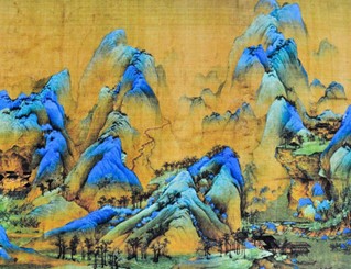
A Thousand Miles of Rivers and Mountains
The five traditional colours, red, yellow, blue-green, black, and white, drawn from mineral and plant pigments in ancient China, have also re-entered packaging design not as nostalgic gesture but as deliberate cultural vocabulary. The colour system carries specific symbolic weight: red for joy and prosperity, black for solemnity and depth, white for purity. Brands applying this system are communicating in a colour language with thousands of years of shared cultural encoding.
Egyptian Symbology
Ancient Egypt's visual grammar has proven extraordinarily durable in modern branding and packaging. The civilisation bequeathed an iconographic library, the Eye of Horus, the scarab beetle, the lotus flower, the ankh, that remains immediately legible to global audiences.
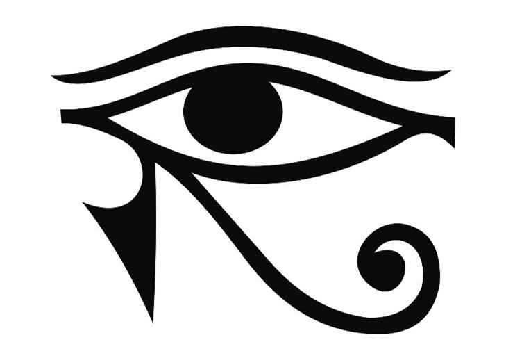
The Eye of Horus
The Eye of Horus carries associations of protection, royal power, and good health, making it a natural fit for wellness, security, and premium product categories. The scarab beetle, symbol of rebirth, regeneration, and the transformative power of the sun, has found use with brands undergoing repositioning or those wishing to convey innovation. The lotus, emerging pure from muddy water, signals purity and ascent, a natural language for beauty and personal care packaging.
The Egyptian colour palette, gold for divine prestige, turquoise for protection and healing, lapis lazuli blue for royalty and the sacred, maps neatly onto the premium end of modern consumer goods. Gold, in particular, has never left luxury packaging design's vocabulary, tracing a direct lineage from its sacred significance in ancient Egyptian theology.
Greek and Roman Mythology
Greek mythology has become perhaps the most widely deployed ancient source in modern brand identity, with packaging as a central vehicle. The hero archetype appears in brands like Nike (named for the goddess of victory) and Red Bull. The lover archetype shapes beauty and confectionery packaging. Beyond archetypes, Greek visual vocabulary, the meander border, laurel wreaths, column motifs, classical portraiture, appears across food, spirits, and lifestyle packaging.
A 2026 guide to packaging for Greek food exports notes the evolution clearly: generic labelling featuring overused blue and white motifs has lost efficacy with premium retailers, replaced by design that highlights specific regional origins through more nuanced applications of classical aesthetics. The lesson is that ancient visual languages work when applied with specificity and depth, not as surface-level shorthand.
Dunhuang and Central Asian Art
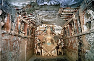
Less universally known but increasingly influential, the wall paintings and decorative patterns of the Dunhuang caves, spanning centuries of Tang Dynasty artistic tradition, have become significant sources for contemporary Chinese visual communication and packaging design. The Dunhuang algal well patterns, with their bifurcated geometric structures, vine patterns, and hierarchical compositions, offer designers a visual system of tremendous complexity and cultural depth. As cultural tourism has grown, packaging for cultural products increasingly incorporates Dunhuang elements, creating a new market for art-historical packaging fluency.
The Consumer Psychology Behind the Appeal
Why does ancient visual vocabulary perform so well in modern packaging? The research points to several converging psychological mechanisms.
The neuroscience of nostalgia is well-documented. When nostalgic feelings are triggered, the memory and reward systems of the brain activate simultaneously, a powerful combination that makes consumers both more attentive and more emotionally open. Kantar's packaging research found a 16% average sales increase for brands that revived vintage or heritage packaging designs in 2024 to 2025. Nielsen data shows that 61% of millennials say nostalgia improves brand perception and purchase intent.
But there is something more interesting than simple nostalgia at work with ancient art forms. Psychologists have identified a phenomenon called "anemoia": a nostalgic yearning for a past one never personally knew. This imaginary nostalgia turns out to be neurologically as powerful as genuine memory-based nostalgia. A consumer who has never seen a Tang Dynasty scroll painting can still respond emotionally to its compositional logic on a tea tin, because the resonance is cultural and imaginative rather than autobiographical.
Deloitte's 2025 CMO report found that 70% of consumers associate nostalgic design with more authentic brand storytelling. This is perhaps the most commercially significant finding: in an era where consumers are alert to manufactured authenticity, drawing on ancient forms provides a depth of cultural reference that modern design alone cannot generate. Ancient art forms are authentic history.
Art Nouveau and Bauhaus: The Pivotal Mediators
Between ancient art forms and contemporary packaging design stand two modernist movements that serve as crucial conduits.
Art Nouveau explicitly drew on ancient and natural forms, the sinuous lines of Celtic knotwork, the organic ornamentation of Japanese woodblock prints, the floral motifs of Byzantine decoration, and translated them into industrial design and packaging. Mucha's work for champagne and tobacco brands in the 1890s established a template that persists in craft gin labels, premium spirits packaging, and beauty products today. The current neo-vintage trend in packaging, which blends retro aesthetics with contemporary sensibilities, traces directly back to this lineage.
Bauhaus created the counter-movement: the "form follows function" philosophy that stripped ornament but retained composition principles developed over centuries. Apple's minimalist packaging philosophy, often cited as a paradigmatic case, reflects Bauhaus influence, but Bauhaus itself was shaped by the study of historical craft traditions. The principle of integrating art, craft, and technology echoes ancient workshop traditions.
Both movements demonstrated that ancient visual intelligence does not need to be reproduced literally to be operative. It can be abstracted, distilled, and re-expressed in ways that preserve the original's structural logic while serving modern manufacturing and retail constraints.
Where the Influence Shows Up in 2025 and 2026
Current packaging trends make the ancient-modern dialogue explicit. Research on 2025 packaging directions identifies several threads.
"Neo-vintage" design, particularly popular with Gen Z consumers, of whom 68% respond positively to nostalgic branding even for eras they did not experience, blends mid-century modern aesthetics with deeper historical references. Rather than exact reproductions, these designs synthesise elements from multiple periods.
"Minimalist Mediterranean" aesthetics have emerged as a premium packaging language, moving away from cluttered classical imagery toward clean typography and earthy textures while retaining the symbolic vocabulary of ancient Mediterranean cultures. Greek food exporters and Italian luxury goods brands have both moved in this direction.
Natural materials, bamboo, wood, leaf fibres, handmade papers, connect modern sustainable packaging directly to ancient traditions. Research notes that bamboo, wood, mat, grass, and leaf were the foundational materials of ancient Chinese packaging. The same properties that made these materials ideal in antiquity, renewability, tactility, cultural resonance, are what make them compelling to 21st-century sustainability-focused consumers.
Typography as cultural heritage is increasingly prominent. Traditional calligraphic letterforms, whether in Chinese, Arabic, or Latin scripts, are being revived not as historical costume but as primary brand voice. The formal beauty of historical type systems offers something algorithmically generated fonts cannot: the weight of human time.
The Tension: Authenticity vs. Appropriation
This influence is not without complexity. The application of ancient cultural forms to commercial packaging raises legitimate questions about cultural sensitivity, depth of understanding, and the difference between genuine engagement with a visual tradition and its superficial exploitation.
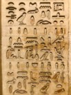
Hieroglyphics
Research consistently identifies that the most effective applications of ancient art forms in packaging succeed not through copying but through understanding. The brands that perform best with traditional Chinese design vocabulary are those that comprehend the symbolic weight of what they are using, knowing that a dragon motif carries specific dynastic and auspicious significance, not simply that it "looks Chinese." The same applies to Egyptian hieroglyphic elements, Greek mythological references, and indigenous pattern traditions worldwide.
The commercial incentive aligns with the cultural imperative here: shallow appropriation is visible to culturally literate consumers and backfires. Generic labelling with indiscriminate classical motifs has already lost its premium market effectiveness precisely because retailers and consumers recognised its superficiality.
Conclusion: Packaging as Living Archaeology
Modern packaging design is, in its most successful forms, a practice of living archaeology: excavating ancient visual intelligence and testing its resonance with contemporary consumers. The evidence that it works is substantial, in sales data, in consumer psychology research, in the persistent presence of ancient motifs on shelves across every market in the world.
The ancient packaging designer who incised a potter's mark on a Greek amphora, who painted an auspicious cloud pattern on a Tang Dynasty container, who gilded a pharaonic vessel in the language of divine power, was solving the same problem that every packaging designer faces today. How do you make someone reach for this, and not that? How do you make a container feel worthy of what it holds?
The answer, it turns out, has been available for several thousand years. The best modern packaging designers are simply paying attention.