

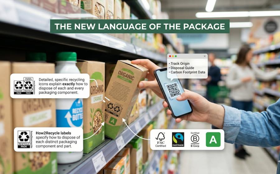

Walk through a supermarket aisle today and you will find something quietly radical happening on the back of every pack. Alongside the usual ingredient lists and barcodes, a new visual vocabulary is appearing: compact icons, colour-coded grades, scannable QR codes, and certification marks that speak directly to environmental conscience. These symbols do not just communicate compliance. They shape perception. They create instinctive associations with responsibility, transparency, and care for the planet.
This piece maps the most significant emerging packaging symbols, explains what they actually mean, and explores why they are becoming some of the most powerful design elements a brand can deploy.
Why Symbols Matter More Than Words
A shopper decides in seconds. Research consistently shows that on-pack visual cues are processed faster than text, and that environmental signals in particular carry strong emotional weight for a growing proportion of consumers. According to industry data, at least 70% of consumers now prefer eco-conscious packaging and many say they are willing to pay a premium for it.
But this consumer appetite has exposed a problem: the old symbols are struggling. The familiar chasing-arrows recycling icon, introduced in 1970, was never designed to communicate nuance. It appears on packaging that is technically recyclable only if you drive to a specialist facility an hour away. Consumer trust in generic green claims is eroding, and regulators are taking note.
"The label on-pack is super critical, but it is being asked to do too much of the consumer education." — How2Recycle / GreenBlue, 2024
The answer is not fewer symbols. It is smarter, more honest ones. A new generation of packaging marks is emerging that prioritises specificity, accountability, and often digital connectivity. Understanding them is now essential for any brand that wants to communicate sustainability with credibility.
The Symbols Reshaping the Landscape
1. How2Recycle Pro and How2Recycle Plus
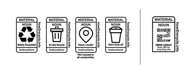
The most widely used on-pack recycling guidance system in North America underwent a major modernization effort in 2024–2025. The legacy How2Recycle label used chasing arrows and broad categories that often confused consumers into assuming curbside recyclability where none existed.
How2Recycle Pro — A redesigned static label that replaces the chasing-arrows icon on certain components with more explicit imagery showing where and how to dispose of packaging. Text instructions are more precise, and the overall design aligns with tightening US state labelling laws.
How2Recycle Plus (with Recycle Check) — A dynamic label featuring a QR code linked to The Recycling Partnership's National Recycling Database. When scanned, it gives the consumer localised disposal instructions based on their postcode in real time. What is recyclable in San Francisco may not be accepted in rural Texas; this label reflects that reality.
The programme now requires member brands to answer more than 60 data points per label, with automated API connections being built to improve data quality. The underlying principle is that accuracy and location-specificity are more valuable than optimistic generalisations.
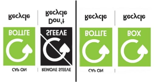
2. The OPRL System (UK)
The On-Pack Recycling Label, long established in the United Kingdom, has become a reference point for global packaging standard-setters. Its strength lies in plain language combined with simple iconography: a packaging component is labelled as either widely recycled, check local recycling, or do not recycle.
From 2026 onwards, the UK's Extended Producer Responsibility (EPR) regulations are mandating the Recycle Now logo on packaging, with the OPRL framework serving as the voluntary complement. The two systems together give brands a route to compliance and consumer communication simultaneously. How2Recycle and OPRL are now formal partners, sharing best practices on defining recyclability and harmonising data internationally.
Key principle: If a label does not tell you where or how to recycle, treat it as aspirational rather than actionable.
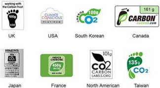
3. Carbon Footprint Labels
Perhaps the most ambitious category of emerging symbols, carbon labels attempt to do for packaging emissions what nutrition labels did for calories: make an invisible impact visible at the point of purchase.
My Emissions Carbon Label — Rates a product on a scale from A (very low, below 1.75 kg CO₂e per kg of product) to E (very high, above 5.5 kg CO₂e), covering greenhouse gas emissions across the full product lifecycle. The format mirrors a nutritional information panel, which deliberately leverages existing consumer literacy.
Carbon labelling is not yet mandatory in most markets, but regulatory and investor pressure is accelerating adoption. ESG-focused institutional investors are linking capital access to quantifiable packaging waste and Scope 3 emissions reductions, making carbon visibility a financial imperative as much as an environmental one. Brands adopting carbon labelling early are positioning themselves ahead of what many analysts expect to become a standard disclosure requirement within this decade.
4. The EU PPWR Harmonised Label System
The most consequential packaging regulation in a generation, the EU Packaging and Packaging Waste Regulation (Regulation (EU) 2025/40, PPWR), entered into force in February 2025 and begins full application in August 2026. It introduces a harmonised labelling framework across all EU member states, replacing a patchwork of national requirements that had made pan-European compliance extremely complex.
Under the PPWR, packaging must carry pictogram-based labels communicating material composition to support correct consumer sorting. Additional symbols are mandated or being developed for:
- Reusable packaging, which must bear a specific label confirming its reusable status
- Deposit-return system packaging, for single-use plastic beverage bottles and similar items
- Substances of concern (e.g. heavy metals), flagged via standardised digital-marking technologies
- Compostable packaging, with distinctions between industrial and home compostability
Harmonised labelling requirements are expected to be fully specified through implementing acts by 2028 to 2029, but the trajectory is clear: the EU intends for every piece of packaging to communicate its end-of-life destiny through a common, instantly legible visual language.
Recyclability Grade (A–E) — The PPWR introduces a mandatory recyclability grading system. From January 2030, only grades A through C may be marketed. By 2038, only A and B will remain. This alphabet-grade approach, visible on pack, creates a direct and intuitive hierarchy of environmental performance for consumers.
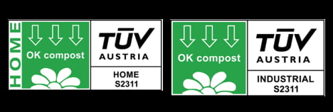
5. OK Compost Labels (Industrial and Home)
As compostability emerges as a complementary strategy for packaging that is difficult to recycle, particularly contaminated food-service containers, certification marks that distinguish genuine compostability from greenwash are becoming critical.
OK Compost Industrial — Indicates the packaging will break down in an industrial composting facility at 55–60°C, complying with the EN 13432 standard. This is the benchmark for commercial food-service and foodware applications.
OK Compost HOME — A higher bar in practical terms, this certification indicates composting at ambient garden-heap temperatures. Based on TÜV AUSTRIA technical requirements, it speaks directly to consumers who maintain home compost bins and want to dispose of packaging responsibly without accessing specialist infrastructure.
The distinction matters enormously. Packaging labelled industrial compostable will not break down in a home compost heap and risks contaminating garden compost if incorrectly disposed of. Brands using these marks correctly build trust; those who conflate them erode it.
6. The Mobius Loop and Its Evolving Role
The classic three-arrow Mobius loop is not new, but its meaning is being refined and, in some markets, restricted. Traditionally a voluntary symbol indicating recyclability or recycled content, it is now appearing in more tightly governed contexts within the EU's PPWR framework, sometimes paired with percentage figures to indicate actual recycled content, and sometimes being replaced altogether by more specific OPRL-style or How2Recycle-style systems.
The trend is toward greater precision: a loop on its own says little; a loop with "30% recycled content, widely recycled" says something meaningful. Brands are learning that the loop, without qualification, is increasingly read by informed consumers and regulators alike as a claim that needs evidence behind it.
7. QR-Code-Linked Digital Product Passports
Cutting across all the above is perhaps the most transformative development: the shift from static symbols to scannable, data-rich labels. QR codes and RFID chips are appearing on packaging not just for marketing purposes but as genuine sustainability information infrastructure.
The EU Digital Product Passport (DPP), embedded in PPWR and the broader Ecodesign for Sustainable Products Regulation, is designed to carry comprehensive composition, recyclability, and end-of-life data across the supply chain. A consumer scanning a DPP-linked code could access verified information on material origins, recycled content percentages, carbon footprint data, and disposal instructions specific to their municipality.
This approach transforms packaging from a one-way communication surface into a living, auditable document. It also creates accountability: brands cannot print aspirational claims on a code that links to verifiable data contradicting them.
The most future-proof sustainable packaging is the one that works within real infrastructure, under real conditions, with real data to back it up. Smart labels are making that verification possible at consumer level for the first time.
What This Means for Brands
The shift from decorative green imagery to functional, verifiable symbols represents a fundamental change in what sustainability communication means on pack. Several principles are emerging for brands navigating this landscape:
- Be specific, not aspirational. Vague terms like eco-friendly or planet safe without a credible certification logo are increasingly risky from both a regulatory and consumer trust perspective.
- Location awareness matters. Systems like How2Recycle Plus acknowledge that recyclability is local. Brands operating across multiple markets need labelling that can flex to reflect regional infrastructure realities.
- Compostability claims demand precision. The difference between industrial and home compostable is not a footnote; it is the entire claim. Conflating the two is a liability.
- Digital and physical work together. QR codes linked to live data will increasingly be the credibility layer beneath static symbols. Brands that build the data infrastructure now will be better positioned as DPP requirements come into force.
- Grading systems create competitive positioning. The EU's A-to-E recyclability grades and carbon footprint A-to-E scales are not just compliance requirements; they are, in effect, sustainability performance scores that will appear on shelves alongside competitor products.
The Bigger Picture: Symbols as Trust Infrastructure
There is something quietly significant about the moment we are in. Packaging symbols began as logistical tools: material codes, barcode systems, handling instructions. They evolved into marketing signals. Now they are becoming something more serious: trust infrastructure.
The consumer who scans a QR code to verify compostability claims, the retailer that requires How2Recycle Pro labelling from suppliers, the investor that links ESG capital to measurable packaging transparency — all are participants in a shift that is raising the evidential bar for every green symbol that appears on a pack.
For brands that have invested seriously in sustainable packaging design, this is good news. The new symbols give them a language precise enough to communicate that investment accurately. For those who have relied on the aesthetic of sustainability without the substance, the emerging labelling regime offers less comfortable reading.
The chasing arrows are not going away. But beside them, a richer, more honest, and more demanding visual language is taking shape. Learning to speak it fluently is now part of what it means to build a brand that consumers can trust.