


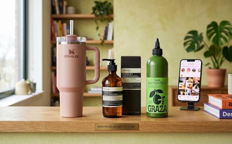

When the Box Becomes the Brand
There is a version of marketing most brands understand well: television spots, paid social, celebrity endorsements, glossy magazine spreads. And then there is something rarer and more powerful: a product that markets itself every time someone picks it up, sets it on a desk, or posts it to Instagram without a brief, a fee, or a brand manager in sight.
Stanley. Aesop. Graza.
Three completely different products: an insulated tumbler, a skincare range, a bottle of olive oil. Three completely different categories. And yet all three share a defining characteristic: their packaging does not merely contain the product. It is the product, at least as far as the consumer's imagination is concerned. It communicates identity, signals values, and creates the kind of tribal belonging that no advertising budget can simply purchase.
This is the story of how packaging became a character and what every brand, large or small, can learn from it.
What Does It Mean for Packaging to Build a Cult Following?
Before we examine the brands, let us be precise about what 'cult following' actually means in commercial terms, because it is not simply a synonym for popularity.
A cult brand inspires behaviour that goes beyond repeat purchase. Fans become advocates. They share unprompted. They defend the brand in comment sections. They tattoo the logo on their bodies. (More on that shortly.) They feel a sense of ownership over the brand's identity, and they introduce it to other people the way they would introduce a good friend: with genuine enthusiasm, not a referral code.
Crucially, a cult following is built on meaning, not just quality. Plenty of products are high-quality and forgettable. A cult brand attaches itself to something the consumer wants to believe about themselves. And packaging, more than almost any other brand asset, is the physical object through which that meaning is communicated, held, displayed, and shared.
Stanley: The Tumbler That Became a Trophy

The Product Most Brands Would Have Killed
In 2019, Stanley, a brand with more than a century of heritage in rugged outdoor drinkware, was quietly considering discontinuing its 40 oz Quencher tumbler. Sales were sluggish. The target market had always been blue-collar men and outdoor enthusiasts. The product did not fit that mould and no one at the company had prioritised it.
What happened next is now one of the most studied pivots in modern consumer brand history.
A group of women behind a shopping blog called The Buy Guide discovered the Quencher, fell in love with it, and began recommending it to their audience. The product sold out almost immediately. Stanley took notice, hired a new president with a background at Crocs, a fellow cult-revival brand, and made a decision that changed everything: they redesigned the colour palette.
More than 30 colourways. Pastels. Limited-edition drops. Collaborations with Starbucks and Target. The move from rugged green to sage, rose quartz, and cream may sound superficial, but it was not. It was a profound repositioning of what the object meant. The Quencher stopped being a camping accessory and became a lifestyle accessory: something you matched to your outfit, collected across colourways, customised with keychains and silicone boots from third-party creators.
The Object as Identity Statement
The design philosophy behind Stanley's cult success is visible in the object itself. The handle fits the hand and the cupholder simultaneously, a deceptively simple ergonomic win that makes the tumbler genuinely useful in daily life. The size (40 oz) is deliberately conspicuous. You cannot hide a Stanley. It announces itself on the desk, in the car, in the gym bag.
That visibility is not a bug. It is the entire mechanism. Stanley understood, or perhaps stumbled upon, something that luxury brands have known for decades: when people carry or display an object publicly, they are making a statement about who they are. The packaging becomes personal branding.
The limited-edition drop model, borrowed from streetwear and sneaker culture, added scarcity psychology to the equation. Sell-outs happen within minutes. Waitlists hit 150,000 people. Purchasing the tumbler became an event, a feat, a minor social triumph worth posting about. The packaging's role in all of this? It is beautiful enough, distinctive enough, and varied enough to be worth posting about. The object is the content.
The results speak plainly. Stanley grew from approximately $70 million in annual revenue in 2019 to an estimated $750 million by 2023, without a significant traditional advertising budget driving that growth.
Aesop: Restraint as a Luxury Signal

The Anti-Brand Brand
Walk into an Aesop store anywhere in the world: Tokyo, London, Melbourne, New York. You will encounter the same experience: the smell of botanicals, natural materials sourced from the local context, bookshelves, quiet. No loud signage. No illuminated brand logo. No sales associate urging you toward a purchase.
And on the shelves: those bottles. Brown glass or matte plastic, black-and-white labels, dense typeset in a clinical serif font. No images. No lifestyle photography. No celebrity face promising radiance.
Aesop's packaging is one of the most quietly radical decisions in modern retail. At a time when beauty brands compete through colour, maximalist design, influencer faces, and algorithmic trends, Aesop chose apothecary minimalism and held to it for nearly four decades, since founding in 1987.
What the Bottle Communicates Without Saying a Word
Every element of Aesop's pack design is a positioning decision masquerading as an aesthetic choice.
The amber glass communicates preservation and ingredient integrity. The label's dense text, listing ingredients, instructions, and sometimes literary quotes, treats the consumer as an intelligent adult rather than a passive recipient of promises. The absence of a traditional logo says: we are confident enough in what is inside that we do not need the exterior to shout.
The result is a brand that signals a very specific kind of sophistication: one that actively rejects conspicuous consumption while being, paradoxically, quite expensive. Aesop has cultivated what analysts describe as an 'intellectual' consumer tribe: people who want to use high-quality products without advertising their wealth in an obvious way. The minimalist pack design is the filter through which that tribe self-selects.
The Store as Extended Packaging
What makes Aesop's approach especially instructive is that the packaging philosophy does not stop at the bottle. It extends into everything: each store is designed by a local architect using local materials. Norwegian slate in Oslo, reclaimed timber in Kyoto, concrete and copper in New York. Two Aesop stores are never identical, but they feel unmistakably like the same brand, because they share the same governing philosophy of restraint with intention.
This is packaging in its fullest sense: not just the container, but the entire designed experience of the brand. When consumers encounter Aesop, they are experiencing a complete, coherent character. They come back not just because the products work, but because they want to inhabit that character again.
The brand reaches its devoted following with no traditional advertising. Word of mouth is the primary acquisition channel. The stores do the talking.
Graza: Function as the New Luxury
The Squeeze Bottle That Started a Category War
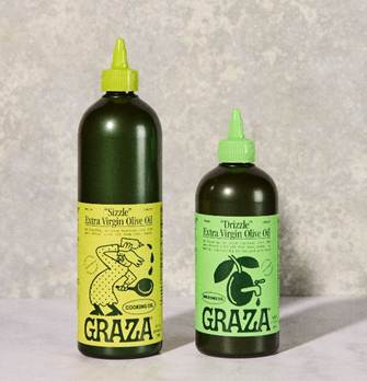
Extra virgin olive oil is one of the most commoditised products on a supermarket shelf. Dark glass bottles, Italian heritage cues, illegible serif fonts, images of olive groves. Every brand telling the same story. Most consumers, as research conducted by Graza's branding agency Gander discovered, could not even define the term 'extra virgin' and yet it was the single most important factor in their purchase decision.
Into this category, in 2022, arrived a bright green plastic squeeze bottle named Sizzle. Its sibling, Drizzle, launched alongside it.
The names alone are a masterclass in packaging as character. Sizzle is for cooking with heat. Drizzle is for finishing. Two words, no explanation needed, no category jargon, no pretension. The names contain both a use instruction and a personality: playful, confident, a little cheeky. They are the kind of names you remember and repeat.
The bottle itself is equally disruptive. In a category where premium quality has always been communicated through dark glass, heavy, stoic, expensive-looking, Graza chose a squeeze bottle made of post-consumer recycled plastic. Not despite it being at odds with category conventions, but because of it. The bottle is functional in a way no glass bottle can be: precise, mess-free, easy to use mid-stir. The medium became the message.
From Sold Out to Tattoo
Graza sold out its initial inventory of 32,504 units within 24 hours of launch. Within a week, the brand had seen a 429% increase in total post interactions across its social accounts. Within three months, it had passed $500,000 in revenue. By late 2025, it had become the fifth-largest national olive oil brand in the United States, largely through organic community growth rather than heavy paid advertising.
The packaging is central to every one of those milestones. The squeeze bottle is photogenic in real kitchens in a way that a glass bottle simply is not. It appears naturally in cooking videos, unboxing content, pantry organisation posts. It is identifiable at a glance. It travels on social media because it looks different from everything around it.
And then there was the tattoo. One Graza fan had the Sizzle bottle illustration permanently inked on their skin. The brand shared it. The community celebrated it. No traditional advertising could have manufactured that moment.
Five Principles of Packaging That Builds a Cult Following
Having examined three brands across three very different categories, a clear set of principles emerges for brands wanting to build this kind of loyal, organic following through design.
1. The pack must communicate identity, not just product
Packaging that builds cult following is never merely informational. It expresses a worldview. Aesop says: quality is understated and intellectual. Stanley says: you deserve to be seen. Graza says: good food should be fun and unfussy. Before any design decision is made, brands must answer the question: what does this packaging say about the person who chooses it?
2. Distinctiveness is more valuable than beauty
All three brands are visually striking, but not in the same way. Aesop is restrained. Stanley is colourful and bold. Graza is playful and text-heavy. What they share is instant recognisability. On a crowded shelf, in an Instagram post, across a busy cafe, you know these objects. In a world where a consumer might encounter hundreds of packaging designs in a single shopping trip, the ability to cut through visually is non-negotiable.
3. The object must earn display
Perhaps the most important insight from all three brands: cult following is built when consumers choose to display the object voluntarily. The Stanley on the desk. The Aesop bottle on the bathroom shelf facing outward. The Graza squeeze bottle on the kitchen counter rather than hidden in the pantry. When packaging is beautiful, distinctive, and meaningful enough that people want it to be seen, they become brand ambassadors through the simple act of living their lives.
4. Function and form must reinforce each other
None of these brands succeeded purely on aesthetics. The Stanley tumbler genuinely keeps drinks cold for hours and fits in a cupholder. The Aesop formulations are genuinely high-quality. The Graza squeeze bottle genuinely solves a real cooking problem. The cult following is built on an experience that the design sets up and the product delivers. Packaging that overpromises what is inside creates disappointment, not devotion.
5. Scarcity, limited editions, and drops amplify existing love
Stanley's limited-edition colourway strategy and Graza's new product drops are not gimmicks. They are mechanisms that reward loyal customers and create cultural events out of ordinary product releases. But they only work because the underlying product and packaging have already created genuine desire. Scarcity amplifies love; it does not create it from nothing.
What This Means for Your Brand
The brands examined here are not unicorns. They are the visible proof of a design principle that is available to any brand willing to treat packaging as a strategic asset rather than a logistical necessity.
The question every brand manager, packaging designer, and FMCG leader should be asking is not: 'How do we make our pack look premium?' It is: 'What character does this pack express? And is that a character our consumer wants to be associated with?'
When packaging becomes a character: specific, consistent, meaningful, and visible, it stops being a cost of goods and starts being the most efficient marketing tool a brand owns. It travels. It earns shares. It creates belonging. It builds, over time, the kind of loyalty that no advertising budget can simply buy.
Stanley proved that colour is not superficial. It is identity.
Aesop proved that restraint is not timidity. It is positioning.
Graza proved that function is not opposed to desire. It is desire.
The pack is the brand. Design it accordingly.
Key Takeaways for Packaging Professionals
- Packaging is not a container. It is a brand character delivered in physical form.
- Cult followings are built when consumers identify with a pack, not just recognise it.
- Distinctiveness on-shelf and in social environments is a measurable commercial advantage.
- Limited editions and colourway drops are most effective when built on genuine design equity.
- The decision to display a product publicly is the highest form of brand endorsement and pack design is what earns it.
For more on packaging strategy, brand design, and industry insights, visit PackagingConnections.com
Tags: packaging design, brand strategy, cult brand, FMCG packaging, Stanley tumbler, Aesop packaging, Graza olive oil, packaging as marketing, pack design, consumer behaviour, brand identity, packaging trends