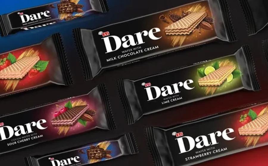
The brief was to reposition Dare as a premium, indulgent snack range that celebrates flavour, pleasure and the joy of discovery.
The key objectives of the rebrand were to inject emotion into the brand and communicate both the quality and the unique sensory experience of the products.
The Dare logo is designed for on-shelf stand-out, while the rich colour palette paired with touches of gold adds a sense of indulgence and appetite appeal.
Attractive imagery is aimed to reflect the multi-sensory experience of the products inside. As part of the design, layered textures are used across the packs.
Alan Gilbody, founder & director, Slice Design, said: “Our aim was to create packaging that invites consumers into a world of indulgence. From the visual storytelling to the tactile contrast of textures in each product, everything about Dare is designed to entice. We wanted to give the brand a more emotional, aspirational feel that connects through taste and experience.”


