
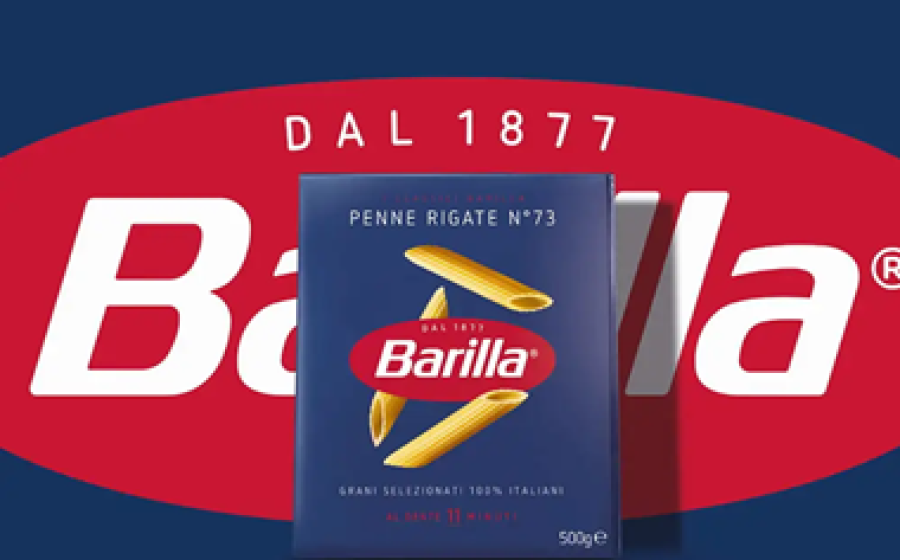

Barilla has worked to create the Barilla Classics boxes made from responsibly managed forests and with many new features.
PLASTIC WINDOW, NO MORE
They decided to get rid of the plastic window they had on the boxes to move towards a more sustainable solution and reduce the number of materials used for the packaging. This allowed them to avoid placing unnecessary plastic on the market, amounting to around 126.000 kg of plastic per year. Although the window on the boxes wasn't limiting the recyclability of the packs—as modern recycling systems can differentiate—they opted for a more sustainable one: as they will always look at how they can become even more sustainable at Barilla.
CARDBOARD FROM RESPONSIBLY MANAGED FORESTS
They use cardboard from responsibly managed forests according to the most widespread international schemes, which guarantee sustainable forest management, based on environmental protection, respect for cultural rights and traditions and promotion of the economic sustainability of forestry activities.
Moreover, they use the best possible quality paper to pack the pasta for their customers: the Blue Box is made with virgin fibers. Because it is in direct contact with the pasta, virgin fiber allows them to ensure the utmost quality and safety for consumers. The resulting boxes are fully recyclable in the paper industry, as part of a circular economy.
This is a step in Barilla’s approach towards reducing our impact on the environment.
NEW LOGO
The logo has been redesigned with the intent to achieve a harmonious, rational and solid typographic composition.
The oval shape is reworked to reassure a symmetrical gestalt, and the timeless and solid typeface refined to amplify and stand out on boxes.
Finally, the founding date is the clearest statement of our Brand’s heritage and expertise.
NEW DESIGN
Barilla is proud to present their new visual identity as part of the ongoing evolution of the company's brand: the harmonious lines and colors convey their historical roots as well as a fresh taste of modernity.
Additionally, a more intense premium red has been chosen for the logo to express Barilla’s love for pasta and is the perfect complement to the new Barilla blue.