

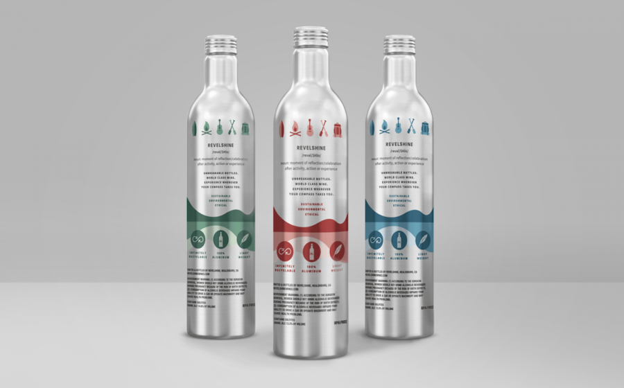

The front label artwork shows nature-based images such as a golden sun and "simple, flowing" landscape depictions that look to be both "suggestive" and "subtle". The back label, meanwhile, features a series of icons featuring outdoor activities such as a simplified surfboard, campfire, guitar, oar and a backpack. These icons were "styled to remind consumers to enjoy Revelshine with all of their outdoor adventures," according to Motto.
The colour palettes were similarly nature-oriented: Revelshine Red uses green inspired by forests; Revelshine White's rich blues were inspired by the ocean; and Revelshine Rose's red hues draw from the tones found in desert canyons.
Motto adds that the logo is "intentionally simple and down to earth," styled in black uppercase sans serif lettering to prioritise clarity and functionality.