

June
19
/ 2023
169
views
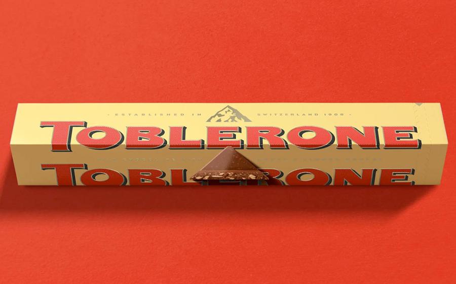
Bulletproof added off-center accents and thick bases to the letter E. The triangular shape of the case is retained, but the black is swapped for blue in the logo's shadow, and the bottom of the logo overlaps a panel crease.
The Matterhorn artwork has been reworked and now appears above the logo. The new illustration of the Matterhorn preserves the hidden bear, a symbol of Bern, Switzerland. An enlarged image of a piece of a broken chocolate beak is placed on several panels, and the Matterhorn appears on a side panel, accompanied by the signature.
display_title
Bulletproof redesigns Toblerone packaging
Categories
Short Description
Toblerone is a swiss brand chocolate property of Mondelez, famous for its triangular shape. Bulletproof collaborated with the brand to create a refreshed brand story and visual identity that embraces Toblerone's long tradition of being different.