@media only screen and (min-device-width: 320px) and (max-device-width: 480px) { ... }
.header_top_bg,.news_footer_content{width:100%;}
.header_left{width:60%;float: left;}
.header_right{width:30%;float: right;font-size: 22px;}
.header_black_bg{height:30px;background-color: #1f1f1f;float: right; width:100%}
span, p,div table,h3,td{font-size:13px}
p{
font-family:Lato, sans-serif;
}
h1{
font-family:Quicksand, sans-serif;
}
h2 {
color: #F34E32;
font-size: 24px;
margin: 0;
font-weight: normal;
font-family: Georgia, serif;
}
p {
color: #967B76;
font-size: 14px…
body {
padding-top: 0;
padding-bottom: 0;
padding-top: 0;
padding-bottom: 0;
margin: 0;
width: 100%;
-webkit-text-size-adjust: 100%;
-ms-text-size-adjust: 100%;
-webkit-font-smoothing: antialiased;
border : none !important;
}
.tableContent img {
border : none !important;
display: block;
outline: none;
}
a {
color: #382F2E;
text-decoration:none;
}
p, h1 {
color: #382F2E;
}
a.link1 {
}
a.link2 {
}
.bigger {
font-size: 24px;
}
.bgBody {
background: #dddddd;
}
.bgItem {
background: #ffffff;
}
h2 {
color: #F34E32;
font-size: 24px;
margin: 0;
font-weight: normal;
font-…
@media only screen and (min-device-width: 320px) and (max-device-width: 480px) { ... }
.header_top_bg,.news_footer_content{width:100%;}
.header_left{width:60%;float: left;}
.header_right{width:30%;float: right;font-size: 22px;}
.header_black_bg{height:30px;background-color: #1f1f1f;float: right; width:100%}
span, p,div table,h3,td{font-size:13px}
p{
font-family:Lato, sans-serif;
}
h1{
font-family:Quicksand, sans-serif;
}
h2 {
color: #F34E32;
font-size: 24px;
margin: 0;
font-weight: normal;
font-family: Georgia, serif;
}
p {
color: #967B76;
font-size: 14px…
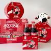
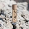
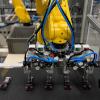
It has been an exciting year for us in 2016 and we enjoyed wonders of packaging through various adventurous routes. We strongly felt that there was a huge poverty in packaging knowledge sharing and so we continued to fill that gap with our new services targeted towards packaging education and career. We also worked in extending our resources and services to help start-ups and entrepreneurs for their packaging requirements.
SUCCESS is a vehicle that moves on a wheel called HARD WORK but THE JOURNEY is impossible without the fuel called SELF CONFIDENCE.
The above…
@media only screen and (min-device-width: 320px) and (max-device-width: 480px) { ... }
.header_top_bg,.news_footer_content{width:100%;}
.header_left{width:60%;float: left;}
.header_right{width:30%;float: right;font-size: 22px;}
.header_black_bg{height:30px;background-color: #1f1f1f;float: right; width:100%}
span, p,div table,h3,td{font-size:13px}
p{
font-family:Lato, sans-serif;
}
h1{
font-family:Quicksand, sans-serif;
}
h2 {
color: #F34E32;
font-size: 24px;
margin: 0;
font-weight: normal;
font-family: Georgia, serif;
}
p {
color: #967B76;
font-size: 14px…


 Continue Reading Further Packaging Information On Follow Made Updates At PackagingConnections.com