

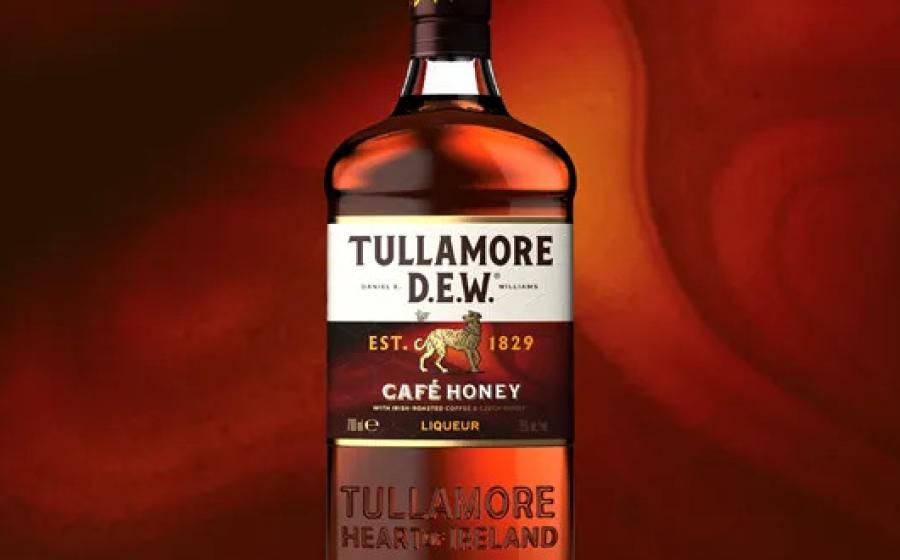

The dark amber label is brought to life with subtle, richly textured swirls that evoke the layered complexity of coffee, honey, and whisky.
A honeycomb pattern in tactile varnish adds further depth, while a tiny bee buzzing around the brand’s iconic Irish wolfhound delivers a playful yet sophisticated nod to Tullamore’s down-to-earth character.
Café-style typography for the variant name, paired with golden icons along the bottle’s side, completes the flavour story with warmth and premium charm.
Dom Burke, executive creative director Knockout, said: “Tullamore sets itself apart with equities that show real pride in its roots. We needed to tell the flavour story in a way that complemented and respected the brand’s authenticity – a design that was simple, intuitive and premium.”
Tom Stannard, global head of innovation and design, Tullamore D.E.W. added: “It’s a concept that combines three local crafts, inspired by two drinking cultures, blending into one truly unique liquid. Café Culture meets Irish Whiskey. A match made in Tullamore. Knockout’s design helps us deliver this distinctive message in a visually striking way that stays true to our roots.”