

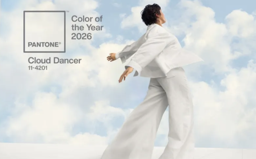

Cloud Dancer, Pantone’s Color of the Year 2026, is a soft, airy white that feels like a breath taken above the noise of everyday life. It is quiet but not empty, gentle but not weak—a color that turns down the volume without turning off the light. In a world that has been running on overload for years, Cloud Dancer arrives as permission to pause, soften, and start again with intention.
The mood of Cloud Dancer
Cloud Dancer is the visual language of exhale. It evokes freshly washed linen, early morning mist, and the blank page just before the first word appears. It is not a clinical, cold white; instead, it carries a subtle warmth that feels human, lived‑in, and welcoming. This warmth is what makes it so emotionally resonant: it suggests clarity without harshness, simplicity without emptiness, and purity without perfectionism.
In a culture that often celebrates intensity—louder colors, faster trends, more stimulation—Cloud Dancer stands for a different kind of courage: the courage to be still. It doesn’t compete for attention, yet it quietly changes the atmosphere. Placed in any space or design, it invites light, reflection, and a touch of grace.
A canvas for new beginnings
Every year, the chosen color becomes a mirror to our collective state of mind. Cloud Dancer reflects a longing for reset. It feels like the fresh coat of paint before moving into a new home, or the first day after a big decision when life feels both uncertain and beautifully open. It is the color of possibility.
Because it is so softly neutral, Cloud Dancer behaves like a canvas rather than a spotlight. It allows other shades—muted sages, dusty roses, inky blues, earthy browns—to stand beside it and tell their stories more clearly. Designers, artists, and stylists can lean on it as the quiet base that holds bolder gestures together, giving cohesion without ever overwhelming.
In interiors: light, calm, and presence
In interior spaces, Cloud Dancer transforms rooms not by dominating them, but by opening them up. On walls, it reflects natural light with a gentle glow, making spaces feel larger yet more intimate. Unlike stark whites that can feel sterile, this shade softens hard lines and blends seamlessly with natural materials like oak, linen, clay, and stone.
Imagine Cloud Dancer walls paired with warm wood furniture, woven rugs, and ceramic pieces in earthy tones. The result is a space that feels grounded and modern, but also deeply comforting. In bedrooms, it becomes the color of rest and ritual; in living areas, it brings harmony; in workspaces, it offers a backdrop that clears mental clutter and enhances focus.
In fashion: quiet luxury and effortless elegance
In fashion, Cloud Dancer lives at the intersection of minimalism and softness. It carries the language of quiet luxury: clean silhouettes, tactile fabrics, and details that reveal themselves up close. A Cloud Dancer trench, a fluid dress, a crisp shirt, or tailored trousers instantly feel elevated without trying too hard.
Because it is seasonless, this shade moves effortlessly from winter to summer. In colder months, it pairs beautifully with charcoal, cocoa, and deep navy, creating striking contrasts that still feel refined. In warmer seasons, it blends with pastel tones, soft metallics, and natural fibers, giving outfits a light, breezy, almost weightless mood. Worn head‑to‑toe, Cloud Dancer becomes a statement of serene confidence.
In branding and digital design
For brands, Cloud Dancer is an invitation to communicate trust, clarity, and calm. It works beautifully as a primary or secondary background color, allowing typography, icons, and imagery to breathe. Paired with a restrained palette—charcoal text, muted accent colors, subtle gradients—it creates interfaces and visuals that feel modern, accessible, and soothing to the eye.
Wellness brands, slow fashion labels, mindful tech products, and sustainable ventures will find in Cloud Dancer a natural companion. It whispers values like transparency, simplicity, and honesty. Used thoughtfully, it can reduce visual noise in digital spaces and offer users a sense of ease as they navigate content and choices.
An emotional anchor for a changing world
Beyond design, the true power of Cloud Dancer lies in how it makes us feel. It suggests that beauty doesn’t have to be loud and that presence doesn’t always arrive with drama. It is the color of clean slates and soft landings, of rooms that welcome you as you are, of clothes that let your personality speak louder than the fabric.
In 2026, as the world continues to shift and reorganize itself, Cloud Dancer becomes an emotional anchor. It reminds us that starting over can be gentle. That clarity can be kind. That the most powerful spaces—outer and inner—are often the ones where there is room to breathe, to think, and to dream again.
Cloud Dancer is not just the color of the year. It is an atmosphere, a gesture, and a quiet promise: there is still space for softness in a fast, bright world.