




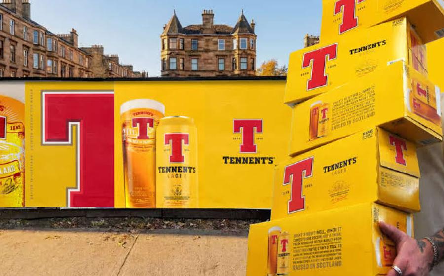

Design agency Thirst has partnered with iconic Scottish lager Tennent’s, repositioning the brand visual identity for a new generation.
Tasked with refreshing the core brand identity, the challenge was clear: while Tennent’s remained a national icon, it was no longer moving with the times.
Among younger drinkers in particular, the brand risked being seen as familiar but not fresh and more associated with tradition than progression.
The redesign amplified Tennent’s most recognisable asset, the red ‘T’ – giving it greater scale, depth and confidence.
A richer colour palette, refined typography and enhanced craft cues restored a sense of pride and presence, both on shelf and in hand.
Building on this foundation, Thirst worked closely with Tennent’s on the introduction of its new innovation pipeline demonstrating how the brand could evolve while staying true to its lager heritage.
This has already resulted in the launch of Tennent’s Bavarian Pilsner – a limited-edition release inspired by the pioneering spirit of Hugh Tennent, fusing Glaswegian grit with traditional Bavarian brewing methods and Tennent’s Tops, a zesty twist on the classic recipe that will play into new occasions and audiences this summer.
Hazel Alexander, senior brand manager, Tennent’s Lager, said: “Working with the team at Thirst has been a genuinely collaborative experience from the very beginning. Starting with the core rebrand and now extending into innovations like Bavarian Pilsner and Tennent’s Tops, they’ve helped us evolve the brand visual identity in a way that feels both progressive and authentic to who we are.”
Matt Burns, founder and creative director, Thirst, added: “With iconic brands, the smallest changes carry the most weight. You’re not trying to reinvent, you’re refining, strengthening, and giving the brand the confidence to move forward. What looks incremental on the surface can unlock something much bigger: a system that allows the brand to evolve, expand and stay relevant over time.”