




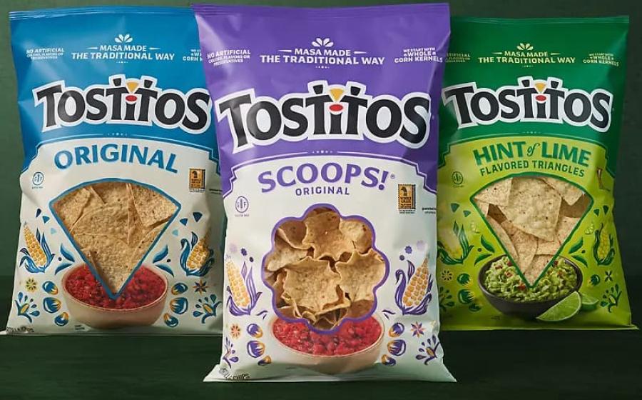

Frito-Lay, a subsidiary of PepsiCo, has introduced refreshed packaging for its Tostitos tortilla chip brand in the United States. The redesign focuses on the brand's heritage, ingredient quality and the role its products play in bringing people together.
The updated packaging aims to communicate the story behind Tostitos more clearly while improving product differentiation on retail shelves. According to the company, the new visual identity is inspired by tradition and designed to highlight craftsmanship, quality and connection.
New Visual Identity for Tostitos Packaging
The refreshed design introduces a cream-coloured background for the Original and SCOOPS! Original varieties, creating a consistent visual identity across the core product range. The Hint of Lime variety features a vibrant green colour to communicate its flavour profile.
Instead of relying primarily on product photography, the new design uses illustrations inspired by corn kernels and cobs. These visual elements highlight the traditional process of making tortilla chips from whole corn kernels and masa.
The redesign also makes the Tostitos logo's distinctive elements more prominent, reinforcing the brand's association with sharing food and social gatherings.
Clearer Communication of Product Attributes
A key objective of the packaging refresh is to make product information easier for consumers to identify.
The updated packs highlight several product attributes, including:
- No artificial colours, flavours or preservatives.
- Made from whole corn kernels.
- Gluten-free labelling where applicable.
- Eight grams of whole grains per serving.
By bringing these messages into greater focus, the new packaging seeks to respond to consumer interest in ingredient transparency and food quality.
Jess Spaulding, Vice President of Marketing at PepsiCo Foods US, explained that the redesign aims to communicate the brand's traditional production methods and its place in everyday meals, hosting occasions and social gatherings.
Packaging Design Supports Brand Positioning
The Tostitos redesign demonstrates how packaging graphics can help communicate a brand's positioning without requiring a complete change to the product itself.
The cream-coloured background creates consistency across core products, while brighter colours distinguish flavoured variants. Illustrations provide an opportunity to communicate product heritage and manufacturing traditions in a visually engaging way.
This approach combines brand recognition with clearer product differentiation, helping consumers navigate the product range at the point of purchase.
Implications for Flexible Packaging
For the flexible packaging industry, the redesign highlights the importance of coordinating graphic design, colour management and production capabilities when implementing a brand refresh across multiple SKUs.
Changes to packaging artwork must maintain visual consistency across different product variants while meeting the technical requirements of printing, converting, sealing and filling operations.
Packaging World also reported that the redesign involved a combination of flexographic and rotogravure printing, expanded-gamut colour reproduction and a matte overprint varnish to achieve the intended visual appearance. The existing bag format and filling equipment were retained, helping minimise operational disruption during implementation.
These considerations illustrate how a packaging redesign can involve significant collaboration between brand owners, designers, printers and packaging converters, even when the basic pack format remains unchanged.
Rollout Across US Retail Stores
The refreshed Tostitos packaging began rolling out across US stores in spring 2026. The initiative forms part of a broader effort by PepsiCo Foods US to strengthen the brand's positioning around quality ingredients, traditional preparation methods and shared food experiences.
For packaging professionals, the launch offers an example of how visual design, product information and printing technology can work together to strengthen brand communication while retaining established packaging formats.