

Big changes are brewing over at the biggest tea company in the world.
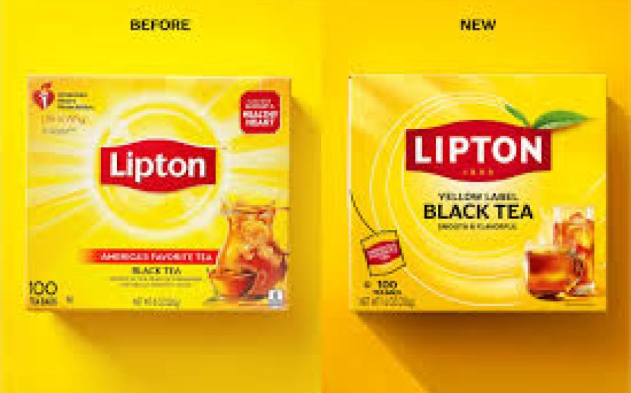
On May 21, Lipton announced its most significant brand transformation in more than a decade, which includes a redesigned logo and packaging, as well as brand-new products.
“Since its founding in 1890, Lipton has enabled tea to be accessible for everyone and is now a staple of the American pantry,” Lipton said in a press release. “Today, that mission lives on with a renewed purpose, inspired by a bold new look.”
The brand says its refreshed identity “bridges heritage and modernity” while keeping its signature red badge and yellow background that’s inspired by the sun. The founding year of the company has also been added and, for the first time since its original design, the Lipton logo is in all-caps.
Additionally, individual tea tags have been simplified to include solely an “L” on one side and the tea type on the other.
In its 135-year history, Lipton has had five other logos. Its original packaging included founder and Scottish tradesman Thomas J. Lipton until 1972, when it was simplified to a black and red logo. The logo was changed again in 1992, 2002 and 2014 before its latest design.
Lipton also recently introduced two new blends to its repertoire: English Breakfast and Earl Grey, which are both nationally available. It also plans to drop a line of fruit and herbal teas this summer.
Lipton is just the latest brand to take inspiration from its own past. Others who have returned to a more old-school look include Mountain Dew, Pepsi and Burger King, the latter of which debuted a more retro-inspired logo in 2021.