

As part of its strategy to provide high-value, innovative, and environmentally responsible products, Lecta introduces Linerset FP, a groundbreaking high-performance barrier base paper designed for flexible packaging solutions.
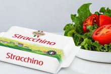
This product is the ideal solution for converters and printers seeking to incorporate advanced barrier properties into their packaging, or using it as it is, offering a strong, flexible, translucent alternative for use in bags, pouches, and wrapping applications.
At the present time, when commitment to sustainability is a must, Linerset FP stands out as an innovative product that allows the replacement of non-recyclable multilayer packaging with fully recyclable alternatives. Tailored for use in flexographic printing processes, Linerset FP not only meets but exceeds market demands for more sustainable packaging solutions.
